
WRESTLING FOREVER
New Style, Who This?
Hello and welcome back to Day 5 of the Daily Devlog Bonanza! How have you been? Still wearing you mask in public and not being rude to retail workers in these stressful times.Anyway, today we’re going to talk about the new style of our game page and some of the images we uploaded recently to the home page.
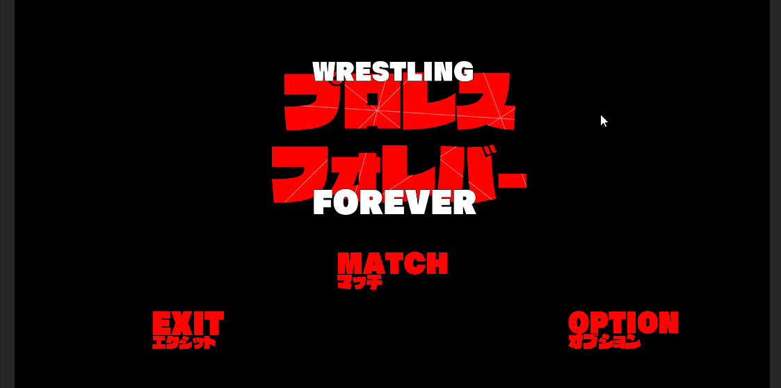
Up first, the colours! To start things off I have a question for you, what’s Black White and Red all over? The Wrestling Forever : Jobber Itch.io page! Wait, why did you say a penguin with sunburn? Can penguins even get sunburn? I’m getting distracted, back on topic. The use of colour in the game has become more and more of a focal point as we work through the early development process, as the more the game finds its sense of sense, the better we can represent it. As some of you may have noticed, the title screen now featured on the page and the logo headers on the page feature a mix of English lettering and Kanji lettering. This is intended as an homage to to Anime sequel title screen that grab the readers attention as something “different” to everything else on the shelf. After all, that’s how marketing is supposed to work. Once you he decision was made to use a combination of languages (that mainly consists of translations rather than unique phrases) up next was the font. We wanted to keep the font bold and blocky when it came to titles and headings in our development materials, as it emphasises the bold and “in your face” nature of wrestling as a form of entertainment. With this and a little inspiration from the “Kill la Kill” logo, our logo and basic sense of style was born.
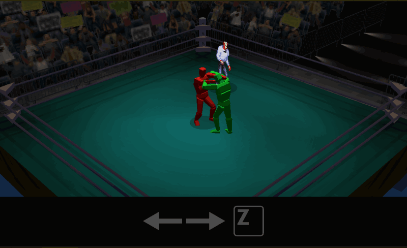
Of course, using nice fonts and lettering to catchy someone’s eye is all well and good, but we all know colour is what really seals the deal. As it stands now, we’re working with a mainly black white and red colour pallet for the games documentation, and this is making its way into the game as well. This combination of colours do an amazing job of allowing room to add really eye catching elements that have some depth to them, again referring to the title screen above. However the more we work with these colours we have begun thinking, what if we only use them?
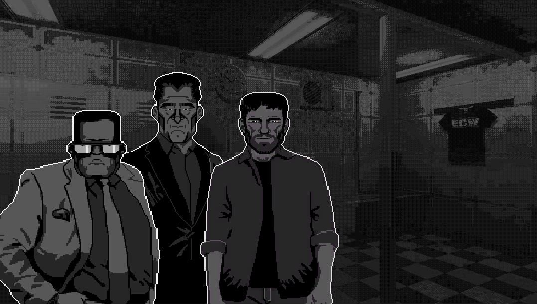
While nothing is set in stone and this may not happen, one thing we have considered at this point in production is shaders. Think about the comics and film Sin City. Stylised black and white for most elements and certain characters or accents appearing in highly saturated colours, making them impossible to miss. This is something we may bring into the game, both development time willing and if we think it meshes well with the direction the game takes later in production. But it’s a thought.
Let me know what you think of our new colours and if you think stylised shaders would look cool! Until next time, stay well!
Get WRESTLING FOREVER
WRESTLING FOREVER
Wrestling Booking Simulator
| Status | In development |
| Authors | Jamie, benjybates, Ottomalara |
| Genre | Role Playing |
| Tags | booking-simulator, Game Design, Low-poly, Retro, wrestling |
More posts
- Game Design DocsDec 12, 2021
- Looking WellDec 11, 2021
- Production TalkDec 10, 2021
- On Your Own (And It Feels So Good)Dec 08, 2021
- Making Five Star StarsDec 07, 2021
- Stylistic Fighting StylesDec 06, 2021
- The Game Name Name GameDec 05, 2021
- The ReturnNov 17, 2021
- Mighty MechanicsNov 02, 2021
Leave a comment
Log in with itch.io to leave a comment.